

I designed these stickers in an attempt to express some frustrations that I've had throughout life. As millennials, we are often referred to as a narcissistic generation. With older generations making constant mentions to participation trophies and our alleged entitlement issues. However, I take massive issue with these claims from older generations.
A lot of the issues that my generation has faced were results of us trying to cope with a crumbled society that was handed to us. We were told that if we worked hard, went to school, got a good degree, and kept in line, we could have the world. But now that we are waist deep in the world, all we have is a student debt crisis, entry level jobs that require 5 years of experience, and our parents generation that previously sang out praises harassing us and calling us entitled. We realize now that the previous generations have ruined the economy, caused unprecedented inflation, and created a job market that allows for no upward growth due to an aging work force populated by those same baby boomers that refuse to retire because of the poor economy, and putting the blame on us.
These stickers were a way of expressing some of these frustrations.
The process to design these stickers started as any good design process does. As a list of words. I first took my subject (Millennials) and the started writing down some common themes that I've seen online and that I've experienced in my own life.

Once I had a list of good ideas, I started thinking about how I wanted to conceptualize these ideas. Things like participation awards, the plummeting housing market, and things like that.

Once I had settled on what I felt were some good concepts, I jumped right into Adobe Illustrator. I find that sketching is good for me just to hammer out a concept, but not to do flesh out the ideas too much. I find once I start playing in the software, things start flowing a lot better for me. I've found that color really has a profound impact on my creative process, so the sooner I can get into playing with color the further I get.
So let's get into the stickers themselves. I'll talk just briefly about my thoughts and feelings about these topics and then I'll go into how I made them.
HOME SWEET HOME...?

As the housing market continues to become overly inflated and interest rates continue to sky rocket, the dream of many Millennials to own a home is one that a lot are giving up on. With this we see the rise of things like tiny homes as well as vans and busses being converted into mobile homes. I hesitate to say the "popularity" of these home alternatives has risen, because many millennials are engaging in these alternative forms of housing because of the ridiculous housing prices.
This is also a commentary on how we used to play in boxes and make houses out of them. But can you really put a price on memories like that? But then again, who wouldn't pay $1 Million to go back to those simpler times?
The Process
The concept of this sticker originally started out as a run down shack, but I recently saw the episode of Spongebob Squarepants where Squidward quit his job at the Krusty Krab saying that he was tired of working for Mr. Krabs and was going to go pursue his dreams. Cut to the next scene and he's begging from a cardboard box. That image resonated with me, and the concept that if anyone wants to buy a house right now, they almost have to just bite the bullet and purchase at these outrageous prices.
So, with that inspiration, we set off to create a simple cardboard box. This was the first sticker that I designed in this series, so it was kind of a good warm up for the other stickers to come.
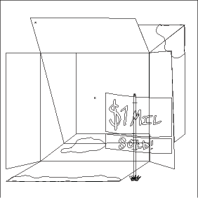
As you can tell by the outline version of this sticker, it's about what it looks like. It's a cardboard box. Plain and simple. However, I wanted to add details that made you understand that for the price, you're not even going to be getting a clean cardboard box. So I made sure to add moisture.

As we make our way through the stickers, you'll notice that they get more detailed.
LIFE'S SIMPLE - AND AFFORDABLE - PLEASURES

I'm not sure what it is about avocado toast, but it's such a delight! However, the older generation seems to think Millennials consumption of things like avocado toast and coffee is the reason that we can't afford houses and are drowning in student loan debt. Because it definitely couldn't be the fact that Boomers are staying in their jobs longer and not retiring so we aren't getting the same jobs that they had access to when they were our age and therefore aren't making as much money. It's interesting that something as simple as veggies on toast could be so controversial.
The Process
First thing first was to make some toast.

The toast was originally made from a top down perspective and then flipped and warped to lay down like that. I then duplicated the main shape, put some space between the objects, linked them together and now we have toast.
After that was done, I wanted to give it the appearance of being toasted, so I added a slight gradient to make the toast look... well... toasted.
Now, the way I make avocado toast I like to use just a cup of mashed avocado and then add everything seasoning. So to emulate that, I basically took my pen tablet and drew lots of little speckles all over the avocado. But I noticed that in the everything seasoning there were these little black seeds that had an ever-so-slight shine to them. So I then went back and added a little shine to every little black dot.

WHERE DID THESE COME FROM?

The Participation Award is probably the most notable of Millennial tropes. You show up to the game, and in an attempt to make everyone feel when they lose, they still get a commemorative award showing that they were there and they participated.
But where did they come from? The answer is super simple. Karen didn't want her precious little Timmy to feel sad about not winning his little league soccer game. But who is Karen? Well, now she's a 70 year old lady wondering why Timmy hasn't returned her phone calls.
So what's the answer to where they came from? The same baby boomer generation that constantly complains about millennials. It's almost like they reinforced bad behavior in an attempt to coddle the millennial generation from what they must have felt was overly harsh treatment from their parents. I don't know a single millennial that was lining up for their participation award after the game. In fact, most millennials I know just threw them away contributing to global climate issues.
The Process
The process to create this sticker was pretty straight forward. It's an award for participating. They are often referred to as participation trophies, so I decided to lean into that.
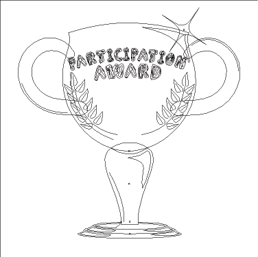
From this view, you can see how the detail works in this image. Overall, it's a pretty simple design. Highlights and shadows were done using a combination of lines and shapes that were white and black set to 50% opacity. This was the 3 sticker in this series that I made, and you will see how as I made my way through this project, I got more and more daring with how I expressed these concepts.
THE TECHNOLOGY GENERATION

Another popular trope is the old "how do you covert a word document to a PDF" thing. The idea being that Boomers aren't generally very good with computers, and so if someone asks for a PDF of a document, they don't know how to covert the file. I had a supervisor that asked me once how to convert a word document to a pdf, and I was stunned that this person made so much more than I did and she didn't know how to click a few buttons. Anytime she wanted to convert a document to a PDF she would actually print the page off, scan it, and then save it as a PDF. How she managed to figure that out and not just click File > Save As is beyond me.
The Process
There were some pretty conscious choices made as part of this sticker. The font that was used for all of the text is Segoe UI Variable Regular. This is the default font for the Windows 11 operating system. I really wanted to maintain that level of detail and precision with the font. The font was then outlined so as to not cause problems on other computers.
However, the part that I'm most proud of is the keyboard.

If you look closely enough, you'll notice that each key has been custom made including the icons on the Function Row. It's a little detail that took a lot of time, but I feel like it really adds to the over all design.

The tools inside of illustrator made this process very easy as well even though it looks like it would've take a long time. Overall, the end result was well worth the effort of creating each individual icon and letter.
CONGRATULATONS! IT'S A FICUS!

Due to the economic hardships that Millennials face today, many have opted to forego having a family. So instead of raising children, they have opted for taking care of plants and becoming a "plant parent". Pet parents were a thing for a while, but there were some problems that began emerging with pets. The benefits of plants over pets is that when you're clocking in for your 3rd job that you had to pick up to cover your crippling student loan debt that you took on in hopes of finding a good job as an accountant after college only to be met with a lame economy and stagnant job market, you don't need to worry about it getting hungry, missing you, and destroying your one bed one bath apartment that you rent for over $1000/month.
I know this sounds like a lot of craziness, but each of the experiences that I'm sharing are real stories that I've heard from friends and other Millennials. The question then becomes, how can we fix these problems? And when will things change?
The Process
This sticker was quite the process. I wanted each plant to have a different style and in turn have it's own personality just like kids would. For example, Susie is a small, cute, and cartoonish cactus. Kieth is a Bonsai tree that is still small, but wants nothing more than to be a big tree. Brandon is a type of grass called New Zealand Flax, but the grass is supposed to look like a mohawk like a rebellious teen. Stephanie is a Birds of Paradise plant that's not currently flowering. She recently got her heart broken by a fern and she's not taking it well. And then you have Richard. A strong, stalwart Bamboo. Like any oldest brother, he's and example to his siblings of how to be the best plant you can be.
By far the most intricate of these plants was Richard. I went super heavy on the detail, even though most of it will be lost when printed. But to me, that's kind of the fun of vector graphics. Putting in those little details for your own enjoyment.

That being said, all of those details took their own time. I think a far more impressive view of this would be the outlined mode.

It looks like a jumble of lines like this, but it allows you to see the time and effort that went into creating each stalk of bamboo and the intricate yet subtle gradients on each section of the individual bamboo stalks.
Now, I would be lying if I said that I created each one by individually. I basically started with one stalk,

Each section of bamboo is made up of a slightly concave rectangle, and a brown knuckle beneath it. And then I used the blending tool to add the slightest little gradient to it.
HAPPINESS IN A CAN

The Process
I started this sticker by forming the can and playing with some gradients. I knew that I wanted the can to have that metallic reflection. And while I probably could've made it look more reflective, I kind of liked the matte look of the can. It made the drink look more high end.

After I had the can, I needed to add the label. I wanted the color to go all the way up to the silver lip of the can. So I added the label got it to go where I want, and I got the reflections to bend with the bevel of the can.
After all of that, when it came to the "Anti-Depressant" logo, I wanted to give it a sort of edgy vibe like most energy drinks have, but I wanted to make it look like it was painful almost like barbed wire.

You can tell here that I picked some points on the logo after outlining the stroke of the text, and pulled them out to a point. This gave me the effect I was looking for and so I put it up on the can.

As you can see from the outline, it's all in all a pretty simple design. It doesn't have tons of concentric lines like the Richard the Bamboo plant has. The technique here comes from the use of gradients to give the illusion of depth and shine.

You'll notice how there is almost a sort of vignette on the outside of the can, but then also it gets slightly darker in the middle as well giving the illusion that the can is almost a velvety sort of matte texture, but that there are two key lights shining on it in a photography studio.
THANKS FOR LISTENING!


